
の調査によると CSAリサーチ, 76%の消費者が、母国語で情報が掲載された商品を購入することを好む—but language isn’t just about words. It’s about how those words ask for action. A “Buy Now” button that drives conversions in the US can tank your checkout rate in Japan or Germany. The difference isn’t translation quality; it’s cultural context around urgency, decision-making, and trust.
If you’ve launched the same CTA across multiple countries and seen wildly different performance, you’ve hit the cultural wall. This article breaks down why call-to-action phrasing fails across borders, what data actually shows about regional CTA performance, and how to test and fix your buttons for each market without blowing your timeline or budget.
How Cultural Context Shapes CTA Perception
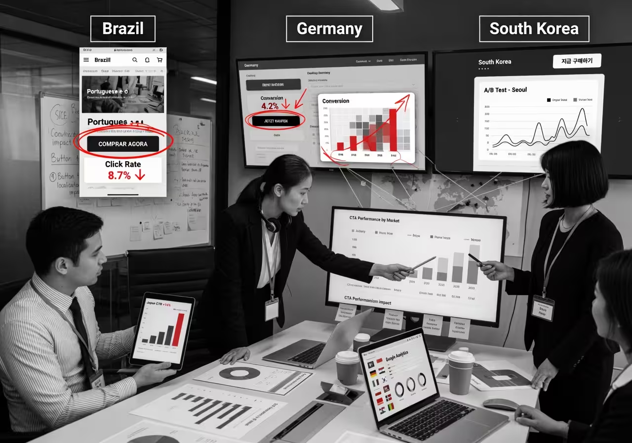
In high-context cultures—where communication relies heavily on shared understanding and implicit messaging—direct CTAs can feel pushy or even rude. Markets like Japan, South Korea, and much of Southeast Asia prefer language that emphasizes harmony, relationships, and long-term value over immediate transactional pressure.
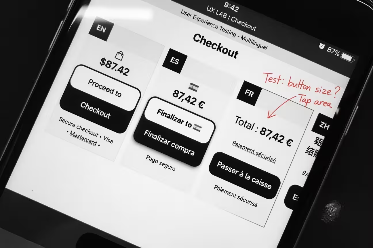
Data from multivariate tests in these regions shows that imperative verbs like “Buy” or “Order” can reduce click-through rates by 12-18% compared to softer alternatives like “Explore options” or “See what fits you.” According to ニールセン・ノーマン・グループ research on cultural UX patterns, users in high-context cultures interpret directness as a lack of respect for their decision process.
Why Urgency Backfires in Uncertainty-Avoidance Markets
In countries with high uncertainty avoidance—such as Germany, the Netherlands, Austria, and Belgium—buyers prioritize thorough evaluation over speed. Urgency-driven CTAs like “Limited time!” or countdown timers often trigger skepticism rather than action.
A/B tests run by European e-commerce teams reveal that urgency phrasing increases bounce rates by 18-25% in these markets. German users, for instance, respond better to CTAs that emphasize security, compliance, or detailed product information. Phrases like “Review specifications” or “Request consultation” align with local buying behavior, which values certainty and risk reduction.
For more on adapting checkout experiences to regional expectations, see our guide on dates, numbers, and currencies.

Language Structure and CTA Effectiveness by Region
Translation alone won’t fix your CTAs. The grammatical structure and verb forms that work in English often produce awkward or overly formal phrasing in other languages. Spanish, for example, has formal and informal second-person forms (“usted” vs. “tú”), and choosing the wrong one can make your brand feel either stiff or disrespectful.
In Latin American Spanish-speaking markets, tests show that CTAs referencing family or community outcomes convert 9-14% higher than individualistic phrasing. A button saying “Secure your family’s plan” outperforms “Get your plan” in Mexico, Colombia, and Argentina. This aligns with Hofstede’s cultural dimensions data, which scores Latin American countries significantly higher on collectivism than the US or UK.
What the Data Says About Asian Markets
Growth teams working in Southeast Asia report that swapping imperative verbs for benefit-oriented phrases increases checkout completion. For instance, changing “Sign up now” to “Start your journey” lifted conversions by 11% in Indonesia and 8% in Thailand during localized campaigns.
In Japan, indirect phrasing performs even better. A test replacing “Buy” with “Examine this option” (このオプションを検討する) resulted in a 16% increase in add-to-cart actions, according to case studies shared by regional marketing teams. Japanese consumers interpret aggressive CTAs as pressure that disrupts the harmony-focused shopping experience.
Color, Icons, and Visual CTA Elements Across Cultures
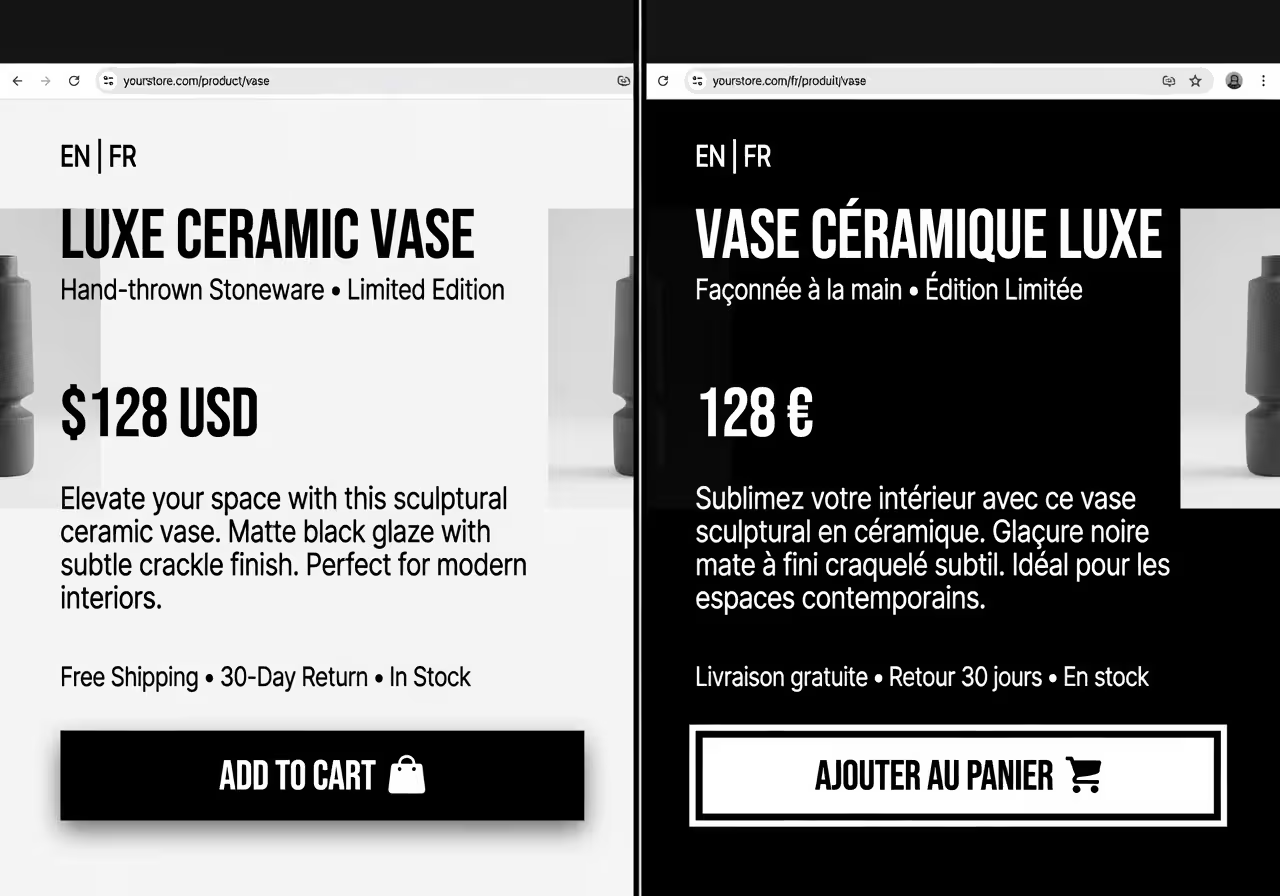
Button color isn’t just a design choice—it carries cultural meaning. In Western markets, red often signals urgency or importance. But in parts of the Middle East and China, red conveys luck, celebration, or warning depending on context, which can confuse urgency messaging.
According to studies by Interaction Design Foundation, green buttons perform well in environmental or health-focused products globally, but in some Latin American contexts, green is associated with financial instability or illness, reducing trust in checkout flows.
Icon Misinterpretation and Trust Signals
Icons like shopping carts, checkmarks, or arrows are not universally understood. In markets with lower digital literacy or different e-commerce norms, a cart icon might not immediately signal “purchase.” Meanwhile, checkmarks used to confirm actions can be confused with selection states in right-to-left languages like Arabic.
Heat-mapping data from Middle Eastern e-commerce sites shows that users hesitate 22% longer on checkout buttons with unfamiliar iconography. Adding localized trust badges (local payment logos, regional security certifications) near CTAs increases click confidence by an average of 13%, according to Baymard Institute usability research.

Testing CTAs Without Wasting Time or Budget
Standard A/B testing platforms give you metrics, but they don’t explain why a CTA fails in a specific culture. The answer often lies in qualitative feedback that global dashboards can’t surface. Here’s how to test smarter.
Use Native-Speaker Panels Early
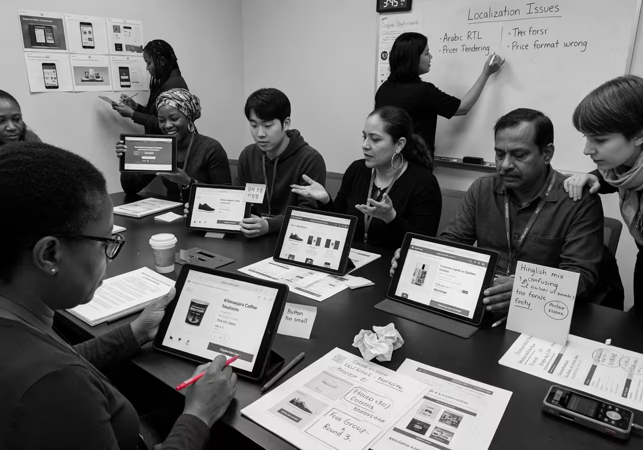
Before running full split tests, show your CTA variants to small native-speaker panels (10-15 people) in the target market. Ask them to rank phrasing by trust, clarity, and likelihood to click. This step catches tone issues that translation tools miss and cuts your testing cycles by 30-45 days.
Platforms like UserTesting or Respondent let you recruit local testers quickly. Budget around $500-800 per market for initial feedback rounds—far cheaper than discovering CTA failures post-launch.
Test Verb Strength and Outcome Focus Separately
Don’t change multiple CTA elements at once. Run parallel button variants that differ only in verb strength (“Buy” vs. “Explore” vs. “Secure”) or outcome framing (“Get started” vs. “Join the community”). Measure scroll depth to checkout, not just click-through rate, because clicks without conversions signal interest without trust.
For example, a SaaS company targeting Germany found that “Request demo” converted 19% better than “Try free” because the former aligned with local preference for expert consultation before commitment.

Regional CTA Best Practices by Market Cluster
High-Context Asia
Emphasize harmony, long-term value, and relationship-building. Use softer verbs like “Explore,” “Discover,” or “See options.” Avoid urgency timers or aggressive scarcity language. Example: “Find what suits you” instead of “Buy now.”
Germanic Europe
Highlight security, compliance, and detailed information. Replace urgency with trust signals. Use CTAs like “Review specifications,” “Request consultation,” or “Compare options.” Add certifications or guarantees near buttons.
Latin America
Frame outcomes around family or community benefit. Use warmer, relational language. Examples: “Protect your family’s future,” “Join our community,” or “Help your loved ones.” Choose informal “tú” forms unless selling B2B or luxury.
Mistakes That Cost Conversions (and How to Avoid Them)
Copying US Urgency Tactics Globally
Countdown timers, “Only 3 left!” warnings, and flash-sale language work in low-uncertainty-avoidance markets like the US or Australia. In high-uncertainty-avoidance countries, these tactics increase cart abandonment by 18-25%. German, Dutch, and Scandinavian users interpret urgency as manipulation, which damages trust.
If you need to communicate scarcity, frame it around delivery reliability instead. For example: “Reserve yours for guaranteed delivery by [date]” performs better than “Hurry, almost gone!”
Assuming One Spanish CTA Fits All
Spanish-speaking markets are not monolithic. Formal “usted” works in Spain’s corporate sectors but feels distant in Mexico or Argentina, where “tú” builds rapport. Regional slang also shifts meaning—”coger” (to take/grab) is innocent in Spain but vulgar in many Latin American countries.
Run separate CTA tests for Spain, Mexico, and South America. Budget 15-20% more time for linguistic validation than you would for other European languages.
Ignoring Color and Icon Cultural Load
A red “Buy Now” button might lift conversions in the US, but in China, red conveys celebration or luck rather than urgency. In parts of the Middle East, red signals danger or warning, which can subconsciously reduce click confidence.
Green buttons often perform well globally for eco or health products, but in some Latin American contexts, green is associated with financial instability. Always test button colors with local heat-mapping and click tracking before scaling campaigns.
For more on visual localization, see our article on colors, symbols, and taboos.

Tools That Actually Help (Beyond Translation APIs)
Most localization platforms focus on text translation, not cultural adaptation. Here are tools that surface CTA friction faster.
Regional Heat-Mapping and Session Recording
Hotjar, Crazy Egg, or Microsoft Clarity with geo-segmentation show where users hesitate, re-read, or abandon checkout flows. Filter sessions by country to spot patterns—if German users consistently hover over CTAs for 5+ seconds before clicking, your phrasing likely feels unclear or risky.
Lightweight In-Page Surveys
Embed simple survey widgets (Typeform, SurveyMonkey) on pre-checkout pages asking: “What’s stopping you from completing this purchase?” Localize the survey in the target language. You’ll get direct feedback on CTA tone, clarity, and trust issues that A/B tests alone can’t explain.
Native-Speaker Browser Extensions
Tools like LanguageTool or Grammarly (set to target language) catch awkward phrasing that machine translation produces. Have a native speaker on your team review localized pages using these extensions before launch—this catches 60-70% of tone issues in under an hour.
主な引用文献
- Consumer language preferences. CSAリサーチ『Can't Read, Won't Buy - B2C』(29カ国、8,709人の消費者を対象とした調査)。. CSAリサーチ
- Cultural UX patterns and high-context communication. Nielsen Norman Group, Cross-Cultural User Research. ニールセン・ノーマン・グループ
- Cultural dimensions and collectivism scores. Hofstede Insights, Country Comparison Tool. ホフステード・インサイツ
- Visual design and cultural symbolism. Interaction Design Foundation, Cross-Cultural Design. IDF
- Checkout UX and trust signals. Baymard Institute, E-commerce Usability Research. ベイマード・インスティテュート
よくある質問
Do I need different CTAs for every country?
Do I need different CTAs for every country?
Not necessarily. You can often group countries by cultural similarity—for example, Germanic Europe (Germany, Austria, Netherlands) or high-context Asia (Japan, South Korea, Singapore). Test within these clusters first, then refine for outlier markets if performance diverges.
How long does CTA localization testing take?
How long does CTA localization testing take?
Expect 4-6 weeks per market if you include native-speaker review, A/B testing, and iteration. Skipping qualitative feedback can shorten timelines but often leads to failed launches that cost more to fix later.
Can I just translate CTAs with Google Translate?
Can I just translate CTAs with Google Translate?
Machine translation handles literal meaning but misses tone, formality, and cultural context. A translated CTA may be grammatically correct but feel awkward or pushy to native speakers, which kills trust and conversions.
What’s the ROI of localizing CTAs?
What’s the ROI of localizing CTAs?
Teams that properly localize CTAs see 8-19% conversion lifts in culturally mismatched markets. The cost is typically $500-1,500 per market for native review and testing—far cheaper than the revenue lost from poorly adapted buttons.
Should I test CTA color or text first?
Should I test CTA color or text first?
Start with text. Cultural tone issues in wording cause bigger conversion drops than color mismatches. Once your phrasing works, test color and iconography to optimize further. Changing both at once makes it impossible to isolate what moved the metric.
 Japanese
  English
  Spanish
  French
  Portuguese
  Italian
  German
  Moroccan Arabic
  Czech
Czech  Greek
Greek  Estonian
  Norwegian
  Icelandic
  Romanian